Design Your Life planner unboxing

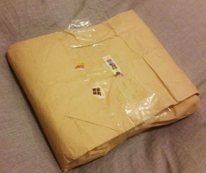
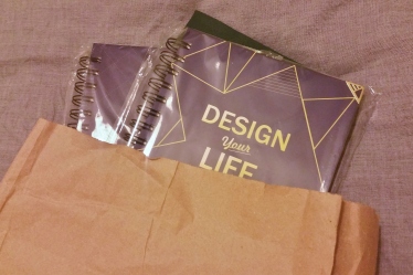
In the middle of Christmas chaos – between gifts and social events and flying between countries – my DYL planners arrived. And I’ve been wanting to share them with you since.

2016-01-15 20.32.02 2016-01-15 20.33.39

But Christmas is its own vortex of stress and excitement, and I started January with one of the most stressful job interviews I’ve ever done. Oh, and I started an internship last week which, while great, demands I get up at 5.30am and get home 8pm – there isn’t much daylight left in the day. And these planners are so nice, honestly, they deserve daytime light so you can see it. But until the days start getting longer, I’ll settle for the selection below!

2016-01-15 20.35.19

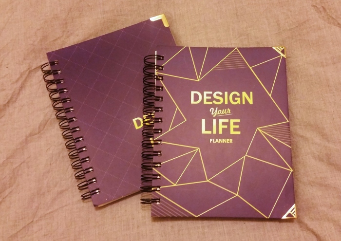
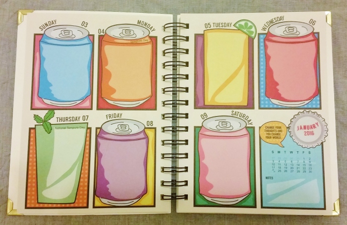
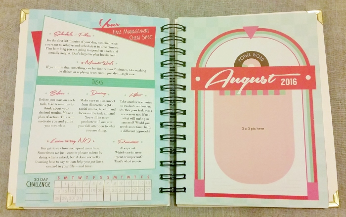
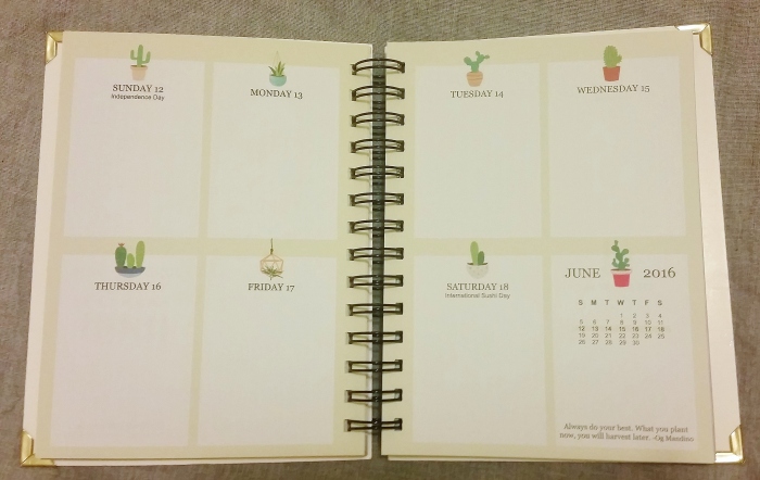
First let’s share some of the pictures of the DYL 2016 planner. Each month has a different theme. Below are some of the ones I really liked – I didn’t want to include too many since part of the fun is flicking through them yourself.

2016-01-15 20.37.102016-01-15 20.37.492016-01-15 20.38.12

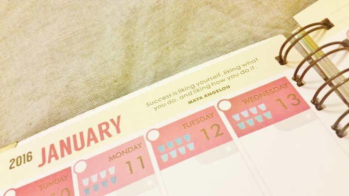
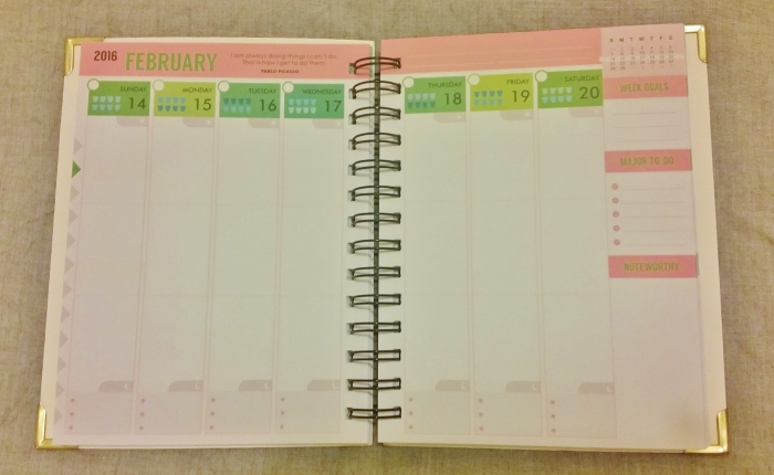
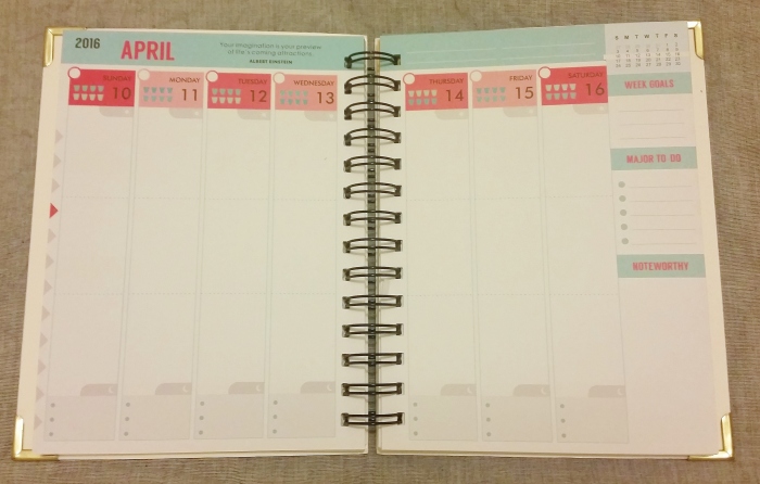
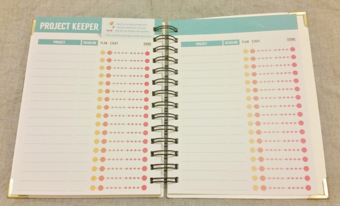
The other planner from Design Your Life is called ‘Back to Basics‘. Each week has a vertical spread, and the colours vary over the months. I really like some of the features in this one, such as the project tracker and the little quotes at the top of each week.

2016-01-15 20.55.432016-01-15 20.39.132016-01-15 20.39.412016-01-15 20.39.49

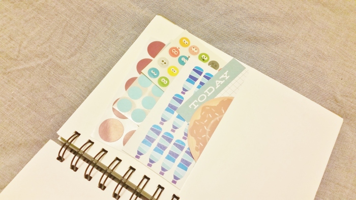
Another nice feature of the planners is the pockets in the front. Perfect for storing some stickers and post-it notes. The first thing I did was fill it up with some of the things I got.

2016-01-15 20.49.28

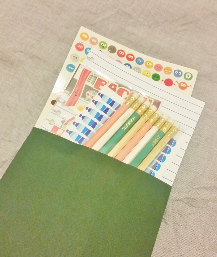
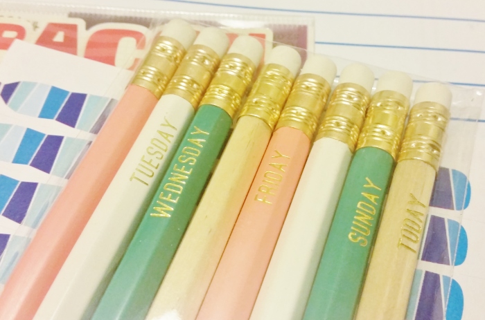
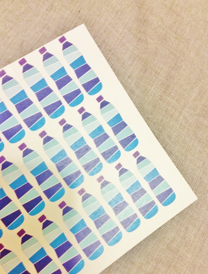
The planners also came with a lovely little goodie bag – full of pencils, stickers, an envelope and some doodle pages for the planner. The hydration stickers are CNS Design, the same people that are behind the DYL planners, and are some of the most fun ones I’ve seen.

2016-01-15 20.41.002016-01-15 20.41.112016-01-15 20.41.52

I’m really looking forward to using these planners more going forward, and hope you find some inspiration in the pages!


Note: These products were all sent to me one of the DYL Planner Experts, the design team for CNS Designs. While the products were provided to me at no cost, all opinions in the text above are my own.

Pastels and emoticons

Maybe I’ve just spent too much time staring at ban.do stuff, but lately I’ve been really excited about the 90s girl gang vibe that they emit! So went I sent of this letter to a friend in Australia, I might just have used it for inspiration.

I know, the ban.do influences aren’t necessarily too clear for others to see, but I stole the pink and gold largely from there and of course the emoticons which I drew throughout the letter.

Since Jane commented on really enjoying the sticky notes I put in the last letter, I decided to include some more unconventional stickies this time around.

Finally wrapped it all up in string and sent off to Australia. Hope it reaches her with a smile on her face!

Mixed some new and vintage stamps on the envelope – really loving the pink angel stamp.

And that’s all for now.
May the Postman deliver ever in your favour,
x

When life gives you lemons

Summer has been drawing to a close around here, but that doesn’t mean that you have to stop using all the bright cheery colours that are associated with it. I spent a few weeks at home in Sweden this summer, and I took the opportunity to use some of my mother’s great stash of tools and paints. All in all this is a rather simple letter, but it was a lot of sun putting it together!

As some may have noticed I love putting together small mail booklets. Below are the pages I put together – almost! As I sat down to pack it all up I decided it didn’t feel quite finished, and added a bunch of small details. Unfortunately, I didn’t have any time to take new pictures. The page excerpts below should still give you a good idea of what it looked like!

Some of the edits included writing in some inspirational quotes, adding extra headings and stickers. And of course a little bit of stamping – I love my roller stamps!

Then it was all wrapped up and put into this bright envelope. A little bit of lemon themed summer.

May the postman deliver ever in your favour,

Alex x.

London Transport Museum

When I cam across some pamphlets from the London Transport Museum I immediately wanted to cut them to pieces and make mail out of them. And so I did! The result was the letter below, sent out to Kat in March but not reaching her until June or so – had me a bit worried there for a bit. Post to Canada generally arrives quicker.

The colours are vintage inspired, but brighter and thus still quite fresh and modern. I included some washi samples, a bit of tape measure, project life cards and other small goodies in the letter.

The mail tag was written on decorated revision cards, which gave me even more opportunity to use the pamphlet illustrations.

The letter is where I used the big illustrations, including my favourite of the bus with people spilling out. I added that to a quick little washi collage which reinforced the colour scheme. Here are some detail shots of the decorations of the letter pages.

All the diffrent bits and bobs where then put into a goodie bag which I used as envelope. I like this extra pop of colour in the mail!

It ended up as quite a bulky letter, but surely that’s only fun?

May the postman deliver ever in your favour,
A

A little something for Amanda

I’m really enjoying finding my way back to making some creative mail again. Had a computer crash (NOOOOOOOO!) but still had some of my outgoings uploaded to the cloud so thought I’d share one of them with you now. So wihtout further ado, here it is:

I loved how the bright red and mint popped, so kept it nice and simple like that. The sticky notes included as a goodie have funny fortune cookie style messages, like “The heart wants what the heart wants: an unending supply of human blood”. I think they’re hilarious, hopefully they will make her giggle too.

The unicorn was a gift from my sister – such a fun little prop. It’s also a pencil sharpener, I’m so fond of it.

Until next time.

May the postman deliver ever in your favour,
A

Vintage Airmail to the Philippines

Here’s a quick look at an outgoing bit of mail I sent off to Joeylyn from the Philippines. It was good fun playing around with the both the brown/kraft and airmail stripes colour schemes. My sister got me a vintage envelopes washi, and I cut that into single envelopes to use as stickers.

I made a small booklet out of sticky notes for the mail tag answers and questions, and added some washi and stamps for decorating purposes. Joeylyn had also just told me that she’s started collecting postage stamps, so I  threw in some of the ones I normally keep to use for decorating.and wrapped them up in tissue paper.

Popcorn tea is something I found in the tea aisle a little while back, and like to send to penpals because it’s funny and a little rare. There’s also a fortune teller fish – you put it in your hand and depending on how it curls it’s supposed to say something about you.

Then everything was bundled up into a little pile of goodies, which I hope that Joeylyn will appreciate! I wrote the letter on decorated revision cards, which is a first for me.

May the postman deliver ever in your favour,

x Alex.

Some Swedish Pride

A new penpal from the US asked me a lot of things about where I was from in her opening letter. Since one of the things that stood out to me during my year there was how few people knew anything about our tiny country in the north, I decided to make Sweden the theme of the letter.

Opening letters are always a little hard I think, and having a theme that directs the letter itself makes it easier to start a conversation. To aid conversation in future letters, a mail tag note was of course there too!

The tuck-ins included some blue and yellow washi tape, since those are the colours of the flag. I also added a small garland with Swedish flag bunting on it.

The airplane sticker flakes were made using some stamps I got on sale just after Christmas, they fit just right on some label paper I had lying around. I quite imagine this will be a recurring thing.

I hope she enjoys this little bit of happy mail!

May the mail man deliver ever in your favour,
Alex.

#Pocketletters

A few weeks back Janette Lane came up with the idea of sending letters in plastic card holders. The idea was genius in it’s simplicity, and it caught on like wildfire, creating it’s own little subgenre in the happy mail world. As someone who is generally late to the party (but enthusiastic when I get there),it was a lot of fun seeing all of this unfold and even participate. And hey – I’ve never gotten to give a tiny movement a name before. That’s right, Janette was kind enough to use my #pocketletters idea for her project! On IG that hashtag is full of inspiration.

Janette also offered to do a one-off swap with anyone who’d discussed the project with her in those early stages, and I gladly put it on my to-do list. Unfortunately, final year at university is a pretty demanding time – any opportunities for letter writing were saved for my penpals, who are too kind and so patient with me.

Eventually, I did come up with this pastel concoction. Everything is in the blue to pink range, with a lot of gold detailing that doesn’t quite show up in the pictures. It’s full of various goodies!

2.2

After I’d made it, it took me another few weeks to send it – and that’s the part that I’m really feeling a bit ashamed about. I’m just bad at making it to the post-office before it closes, and this one here was too heavy for the stamps I had lying around at home.Thankfully, it’s now made it’s way to Janette, and I hope she appreciates it!

2.3

Flowery mail for Sunshine

Sorry for disappearing from this blog and most other places online – exam season is upon me and I’ve had to put snail mailing to the side. But here’s a little something I sent out a while ago. Sadly, it was apparently quite badly damaged on it’s journey.

A while back I was contacted on IG by Ayabulela, also called Sunshine, and after having seen her beautiful mail I really couldn’t say no. This was my first outgoing to her, and to South Africa – I love exchanging mail with people from new places, it feels like such a great opportunity to learn more about them.

She’d said she liked flowers, so I thought that would be a good starting point for a theme.

For this letter, I also wanted to play around a little more with stamps. So I prettied up some ruled paper with some flower stamps, and gave my mail tag headings a nice dotted background. I didn’t have any pink ink, so I doodled on some flowers in pencil, and hand lettered the headings. I also used some of my old scrapbook stash chipboard alphas for her name.

I’d recently bought some new washi tape which I was excited to test drive, so I put together the little garland, as well as some washi collages at the bottom of the mail tag sheets for an additional pop of colour.

The flower card is a vintage cigarette card, and I attached my washi tape sample tags to it. The mini-tags are small gold foiled price tags, just the right size to spin some 15mm washi around. The elastic thread attachment also makes it super easy if you want to just thread them to  your planner rings and bring them with you right off the bat.

I included an envelope with some sticker flakes, paper bits and a Swedish stamp with flowers on it, to go with the theme.

Then I wrapped it all up in the garland, trying to get the flags on it nicely spread out.

Finally it all went into a goodie bag envelope. Royal Mail are currently running with an Alice in Wonderland stamp set, and they’re really cute. I’m definitely going to have to head over and buy a few for future mail.

May the postman deliver ever in your favour,
Alex.

Seeing the greenery themed mail

Maria is a pen friend from Poland who I know loves to travel and enjoys the vintage aesthetic. I always try to play to that when I make her letters, personally I love it when my pen pal has made a clear attempt to include things I like but in their own style.

This dotted stamp is rapidly becoming one of my favourites – it just makes for such a nice detail when you want to emphasize something, like a heading. Besides, it’s an extra pop of colour which can be however subtle the ink you choose to use is.

This letter included quite a long mail tag, that covers a few different papers and a long folded up piece of paper. I also included some retro post cards that fit both the colours and the theme – they’re from the Penguin post card boxes series. They’re great quality and I absolutely recommend them!

I bundled all the bits and pieces – letter, mail tag, post cards, a washi sample and a book plate – together with some green yarn. I love a parcel wrapped in string, can’t help myself!

And then all that was left was to pop it in the envelope and add a return address – just in case.

May the postman deliver ever in your favour,
Alex.